
- Digital and Design Strategy
- Web Design
- Updated 09/30/2026
How to Build a B2B Website for Technical Buying Groups
Summarize this post

Summary: B2B purchases are decided by groups of five to 16 people, and on a technical company’s website, seven kinds of reader show up with seven different motivations: the researcher, champion, skeptic, practitioner, manager, procurement, and the executive. Most sites are built for one of them and lose the others without leaving any trace in analytics. The Buying Group Website Model fixes that in order: positioning and messaging first, then navigation, content, and conversion, then visibility and measurement. Start by comparing who contacts you with who actually makes the decision.
Your website will never tell you which buyer it lost.
A bad sales call leaves evidence. A stalled deal gets a note in the CRM. But when your site fails the wrong reader, nothing happens at all. There’s no complaint and no bounce you can attribute. Nothing in your reporting says the engineer who would have championed this couldn’t find the specifications and went to a competitor.
They just leave. You don’t know who came, and you don’t know who would have contacted you and didn’t. Most website problems are obvious: traffic drops, a form breaks, someone emails to say a page is down. This one only shows up in hindsight, when you change something, a number moves, and you realize what the old version had been costing you.
It’s getting more expensive, too, because more people are involved in each decision. Gartner’s research puts B2B buying groups at five to 16 people across as many as four functions, and found that 74% of buying teams show “unhealthy conflict” during the decision: members with competing objectives, disagreement about the right course, or someone outside the group overruling them (Gartner, survey of 632 B2B buyers, 2024).
All of those people visit your website, and it was almost certainly built for one of them.
This guide covers who the readers in a technical buying group are, what happens when a site picks one of them, and the model we use to build sites that work for all of them.
Seven readers, seven reasons for reading
Start by naming who’s on the site. What separates these readers isn’t the information they want. It’s what they’re trying to accomplish. The information needs follow from the motivation, and you can’t work backwards from a list of content to figure out why someone wanted it.
We see seven roles in most technical buying decisions. Job titles vary a lot from company to company; the roles don’t.
The researcher wants to complete the assignment without missing a qualified option. They’re often the person handed a spec or a set of criteria and asked to build the first list, sometimes in an entry-level or assistant position. They aren’t choosing a vendor. They’re deciding who gets looked at, which means they can take you out before anyone senior ever sees your name. They check boxes, look for signs you’re legitimate, and skim past technical depth. We covered this role, and how it fits the evaluation process, in our guide to marketing to technical buyers.
The champion wants possibility. They’re the early adopter pushing to try new things and adopt better tools. They’re often not typical of the group they’re buying for, since that group tends to prefer things as they are. So the champion has to sell upward to management and sideways to peers at the same time.
The skeptic wants to keep the status quo. They’re the champion’s mirror image, and usually the champion’s real audience: the peers who have to be won over before anything moves. They aren’t asking whether this is better. They’re asking what switching costs them, and whether the change is going to land on their desk.
The practitioner wants their day-to-day to get better. They’ll be using whatever gets chosen, so they’re judging whether it helps them do the job on a normal Tuesday morning.
The manager wants risk mitigated. What could go wrong, and what happens to them if it does.
Procurement wants to see no red flags, and this is the one that surprises people. Procurement has the lowest bar of all seven. They’re mostly confirming they aren’t sending money to a sketchy organization, and sometimes a polished-enough website is enough on its own. What helps is ordinary: locations, a real address, a phone number, photographs of an actual building. The message they need is this is a real company. Teams routinely over-build documentation for the reader who wants the least.
The executive wants their own goals advanced, or at least not put at risk. They’re judged on how their departments and people perform, so the question is whether this decision helps or endangers that.
The executive is also the only reader whose motivation you can’t predict. The other six are consistent: a manager worried about risk at one company is worried about risk at the next. An executive might behave like a champion, because a breakthrough would look great for them, or might be deeply risk-averse. A founder-CEO tends toward visionary. A CTO tends to be more cautious. That’s why “research the specific person” is real advice for this reader and filler for the others.
| Reader | What they’re after | Predictable? |
|---|---|---|
| Researcher | A complete, qualified list. Criteria met, nothing sketchy. | Yes |
| Champion | Possibility. A better way of doing things. | Yes |
| Skeptic | The status quo. A low cost of change. | Yes |
| Practitioner | A better day-to-day. | Yes |
| Manager | Risk, and how it’s handled. | Yes |
| Procurement | No red flags. Evidence you’re a real company. | Yes, with a lower bar than expected |
| Executive | Their own goals advanced, or not endangered. | No. Visionary or risk-averse depending on the person |
One need cuts across several of them. Anyone carrying a recommendation to someone else needs ammunition: the champion, but also the researcher handing up a list, the manager taking a decision to leadership, and some executives. If a person has to defend this choice in a room you’re not in, your site has to give them something that holds up once they get there.
Two ways to get it wrong
With seven readers and one website, there are two ways to fail. You can serve one reader well and leave everyone else without anything. Or you can try to serve everyone at once and give nobody a clear path. Most sites selling to technical buying groups have fallen into one or the other.
We learned the first one the hard way. We worked with a company in the engineering simulation software space whose site was focused on the technical audience. Partway through the design process, we shifted the focus to the manager. We redesigned around that reader and led with what a manager should want: collaboration, cloud-based, no software to maintain, no servers of their own.
It didn’t resonate with managers, or with anybody else.
The messaging wasn’t the problem. Those were real differentiators, unique to that client and defensible across the category, exactly what a positioning exercise is supposed to produce. They fell flat anyway, because a real differentiator aimed at a reader who isn’t driving the decision is invisible. Worse, it looks like a messaging problem, which sends teams off to rewrite copy that was already fine.
When we dug in, the people recommending a change this big were the champions: the engineers who wanted to design new things and needed a more advanced tool to do it. Moving to a new class of simulation software is a major shift, and it doesn’t start with a manager looking for less server maintenance. We refocused the site on the champions, and leads went up.
Then we saw the same pattern with other technical clients. The team narrows to one persona during strategy. Months later, something from sales conversations convinces the client to shift from manager to technical, or technical to manager. We work them through the change, and then find it has left the group they moved away from with nothing.
It happened often enough that it stopped looking like coincidence. The answer is to serve all of them, with clear priorities and a path for each.
The Buying Group Website Model
“Serve all seven, with priorities and paths” is easy to agree with and hard to do. “Better information architecture” isn’t something anyone can act on Monday morning, so here’s the model we build and audit sites against.
The Buying Group Website Model has seven components in three groups. None of the seven will surprise you on its own. What makes it a model rather than a checklist is the order: each group assumes the one before it is settled.
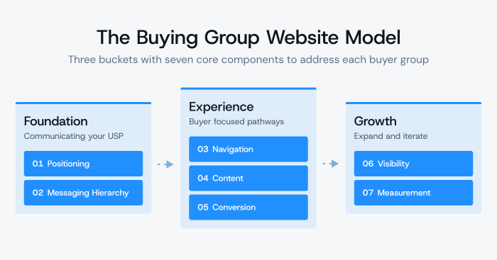
Foundation is what you stand for: positioning, then the messaging hierarchy built on it. Get this wrong and nothing later can make up for it.
Experience is what the site does: navigation, content, and conversion. This is where most website projects start, which is part of why so many disappoint.
Growth is how the site gets better over time: visibility and measurement. Skip these and you’ve built something good that nobody finds and nobody improves.
The order also helps with diagnosis. A navigation problem is sometimes a navigation problem. More often, it’s a positioning problem showing up two floors down, and no amount of menu restructuring will fix it. So the model starts at the bottom.
1. Positioning
Positioning comes first because every other component assumes it. A site can be well structured and well written and still fail, because it’s saying something nobody cares about, or something four competitors already say.
Three inputs go into it:
- Your competitors. Not to copy them, but to learn what each one claims, where they’re strong, and where they’re weak. You can’t be different from a field you haven’t looked at.
- Your audience. What’s relevant to them and what matters most. This is the half that gets skipped, and it’s the half that decides whether a difference is worth anything.
- The gap between the two. What makes you unique in a way the people buying care about.
A strong position has to pass two tests. You need to be significantly different from your competitors in a specific way you can claim: not marginally better, not a matter of emphasis, and not something three other firms could say tomorrow. And that difference has to matter to your audience. A differentiator nobody cares about is trivia. Something they care about that everyone offers is table stakes. You need the overlap.
This is also why the simulation project went the way it did. That client had a real position. It fell flat because it was aimed at the wrong reader. Positioning and audience aren’t separate exercises. A position is always a position for someone, and on a technical site, there are seven someones.
If positioning is where your site breaks down, it’s the first thing we work through in a marketing strategy engagement.
2. Messaging hierarchy
Once the position is set, the next question is how to say it to seven readers without ending up with seven different arguments.
A messaging hierarchy solves that. At the top is one positioning statement: the big picture of what makes you different and why that’s worth something to your market. Underneath it is a layer for each group of readers that reframes the same claim around what matters most to them.
The top statement doesn’t change based on who’s reading. The framing below it does, because technical readers care about different things than management, and executives care about something different again.
The difference between seven versions of your argument and one argument told seven ways sounds subtle. Gartner’s research says otherwise. Content tailored for relevance to the whole buying group improved consensus by 20%, while content tailored to individual relevance had a 59% negative impact on consensus. Groups that reached consensus were 2.5 times more likely to call the deal high-quality (Gartner, 2025).
Gartner was studying content that salespeople use, but a website is the one place where every member of the group reads the same material, so we’d expect the effect to be at least as strong there. Separate pitches for each reader give the group nothing to reconcile, and reconciling is exactly what they have to do. Give each reader their own door into the same building. Don’t build seven buildings.
Build the hierarchy once, and it isn’t only a website asset. The same structure should carry into sales decks, email, ads, and trade show material.
3. Navigation
With one argument framed for each reader, the site’s job is getting each of them to their version of it. The way to do that is progressive disclosure.
Progressive disclosure means starting at a high level, giving anyone who wants more depth a clear path to it, and letting them opt in by clicking toward it instead of handing every reader everything at once. The term gets used loosely. What it means in practice is that the top of every page carries the outcome, the depth sits one deliberate click below, and neither is buried.
This isn’t hard. With six or seven groups, a fairly simple set of paths that lets people self-select is straightforward to build. You don’t have to drop anyone. Priorities decide emphasis and depth, not who gets left out.
What you shouldn’t do is label those paths by audience, like “For Engineers” and “For Executives.” Nielsen Norman Group has argued against audience-based navigation for years, and the reasoning holds up. People come to a site to do something, not thinking about which category they belong to. Making them self-identify adds a step, and many visitors fit more than one category or none of the ones offered (Katie Sherwin, Nielsen Norman Group, 2015). NN/g recommends organizing by topic and task instead.
So sort your navigation by what someone wants to do or learn: technical capabilities and specifications on one path, outcomes on another. Readers still choose their own route. They just never have to declare a role to do it.
Deciding which path gets emphasis depends on how the group works together. Two questions do most of the work: who’s driving the initiative, and how do the others get looped in? A site where the researcher or practitioner does the first round of research and shares links upward is a different site from one where the manager researches and the technical people only get pulled in to check how is this going to affect what I’m doing. Same seven readers, different architecture.
That architecture work is the core of how we approach website design for technical companies.
4. Content
Navigation gets people to the right place. Content decides whether anything useful is there when they arrive.
Each reader needs something different. The practitioner and the champion want depth and specifications, with real, current numbers. The researcher wants to confirm quickly that you meet the criteria. The manager and executive want outcomes. Procurement wants signs of a real operation: an address, locations, a phone number. The manager and procurement both want to see risk handled, which means being told what could go wrong and what you do about it.
That list is useful, but the test behind it is better: are you answering every question, concern, and objection from every person influencing the decision?
Objections are where most sites fall short. They answer questions well, address concerns unevenly, and ignore objections entirely, on the theory that raising an objection plants doubt. But the skeptic already has the objection. Leaving it unanswered doesn’t make it go away. It just means you aren’t part of that conversation.
Case studies are where all of this gets hardest, because the case study is the one page every reader lands on. Other pages can lean toward a reader. This one can’t.
There’s a common criticism that technical case studies describe what was built instead of what changed. That’s only half right. Practitioners like knowing what was built; it’s what they’re reading for. The mistake is including only that. A case study for a buying group has to do both jobs on one page: carry the technical detail without losing the other readers, and carry the business outcome that gets management interested.
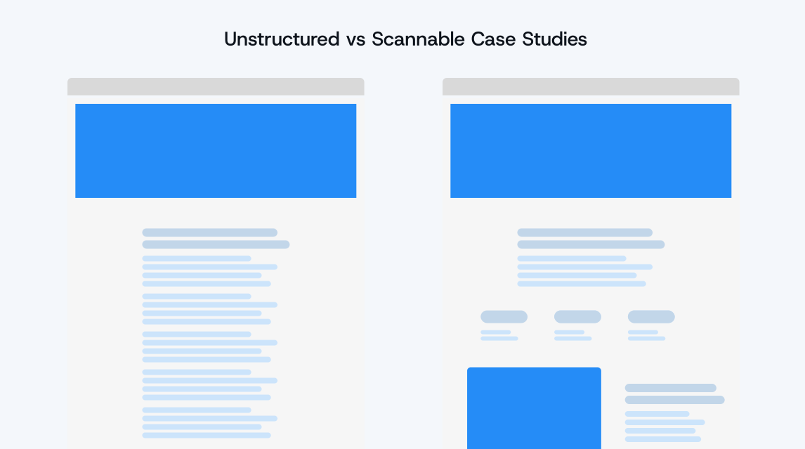
The second problem is density. It’s easy to write a long block of prose, break it up with a few headings, and call it done. What’s missing is everything visual: pulled-out stats, diagrams, process artifacts, before-and-after. If someone can’t scan the page and get the gist, it won’t do much, however good the story underneath is.
Anonymized case studies still work, as long as the situation stays specific. “A $40M industrial automation manufacturer with a 90-day quoting cycle” tells a reader more than a recognizable logo attached to a vague result.
5. Conversion
Good content earns attention. Conversion decides whether you ever find out who was paying it. Two questions matter here: what do you gate, and how many ways can someone raise their hand?
What to gate. Both directions have a cost.
Gate nothing, and you never know who was there. There’s no chance to follow up and no relationship, just a black box you hope works out. That problem grows as buyers do more on their own: 67% of B2B buyers now say they prefer a rep-free buying experience (Gartner, survey of 646 buyers, 2025), up from 61% in Gartner’s survey a year earlier (Gartner, 2024). Fewer buyers will ever reach out on their own.
Gate the wrong things, though, and the researcher and practitioner won’t trade their contact details for something they believe should just be available, like specifications or case studies. They leave without enough information to consider you, and you never hear about it.
There’s a newer cost as well. In that same 2026 Gartner survey, 45% of buyers said they used AI during a recent purchase. An AI assistant can’t read what sits behind a form, so it can’t recommend you based on it. Gating the wrong material doesn’t only cost you a visitor. It takes you out of the answer.
The standard we use for gating: only put content behind a form if it’s valuable enough that people would pay for it. Nobody would pay to watch a product video, download a spec sheet, or read a case study. If you create resources that solve a real part of their problem, like a detailed guide, a tool, or an assessment, people will gladly pay with their contact information. We go deeper on what qualifies in why B2B websites don’t generate leads.
How many ways to raise a hand. This is where most sites are thinnest.
The traditional funnel, where someone is interested, then considering, then deciding, in that order, doesn’t really happen anymore. People bounce back and forth. They research, drop out for a quarter, come back with a new requirement, and loop in three colleagues who start their own research from scratch.
Reducing it to MQL and SQL doesn’t help either, because there are stages inside those. Someone early in their research wants different information and tools than someone close to a sales conversation, and calling both “not yet an SQL” tells you nothing about what to offer them.
So look at the whole buying lifecycle and build several ways to convert across it, instead of one “book a demo” button doing all the work. A calculator or configurator for someone early. A technical deep-dive or comparison for someone building requirements. A consultation for someone validating a decision. The demo request for someone who’s ready. Each one fits a different reader at a different moment, and each one tells you who’s there.
6. Visibility
None of the first five components matter if the right readers never reach the site. Visibility has three parts:
- SEO: being found when someone searches for what you do.
- GEO: being found and cited by AI assistants, a related but separate discipline. It ties straight back to gating, since an assistant can’t read what sits behind a form. Our research on what gets B2B brands cited by AI search covers what works there.
- Content marketing: anything valuable enough that people find it and share it.
You will undersell that last one if you judge it by analytics. A lot of sharing now happens in Slack channels, forwarded emails, and DMs, places you can’t track and won’t see in analytics. Content does real work there whether or not anything shows up in your reporting.
This is where the champion and the skeptic come back in. The champion’s job is carrying your argument into rooms you’ll never enter, and most of the time that means a link pasted into a channel full of people who’d rather keep things as they are. If what arrives is a gated form, or a page that only makes sense to someone who already agrees, the argument stops there, and you never find out it happened.
7. Measurement
A link shared in a Slack channel is only one of many steps in a buying group’s path that never show up in standard reports, so measurement has to go further than the obvious numbers.
Track the outcomes: leads, MQLs, SQLs, traffic. But if that’s all you track, you can’t tell whether the site is working as well as it could, or where it could improve. Be deliberate about the steps in between, and go past Google Analytics. Use heat maps and session recordings. Instrument the specific paths you built in component three, so you can see whether people use them.
The tools are the easy part. What matters is reviewing what they show you and changing the site because of it. Your site isn’t the most effective it will ever be on the day it launches. It’s something you keep iterating on, and the gains build on each other.
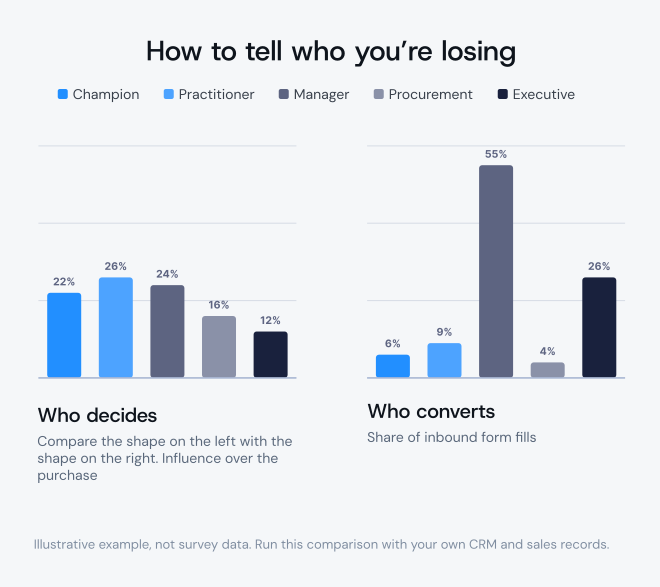
The check that matters most. If you measure one thing beyond the obvious, make it this: does the mix of people contacting you match the mix of people who make the decision?
Look at who’s filling out forms and contacting sales. Is it all managers? Are you seeing no technical people at all, even though you know they’re an important part of the decision?
The confirming detail is often already in your sales notes. The managers who do reach out describe the product as something their technical team recommended. So the technical reader clearly matters, and is clearly missing from your inbound. That gap is the finding, and you can see it with data you already have.
What sales calls tell you. Read the call transcripts, looking for questions that make you think this should have been on the website. If technical people are reaching out but in small numbers, pay close attention to what they ask. One question in one call doesn’t prove a pattern, but it points somewhere.
Neither of these tells you exactly what’s wrong. A mismatch in who contacts you is a finding worth chasing. A question in a transcript is worth looking into. Both tell you where to look, and knowing the difference between a signal and a diagnosis is most of the discipline.
Where to start
Seven components is a lot to take on at once, and most companies start in the wrong place, because they’ve already decided what the problem is.
The two answers we hear most:
“The site is dated.” Usually that’s partly true. By the time someone contacts us, most things need some reworking. But there are plenty of cases where the design is only mildly dated and the real problem is structure, paths, and messaging, none of which a visual refresh touches.
“It’s a traffic problem.” The company decides it needs to rank higher or buy more traffic, and ends up sending more people to a site that doesn’t convert them. That’s the expensive mistake, because it spends budget making the problem bigger.
Start with the check from component seven instead, because it tells you which component is broken. Pull your last fifty inbound contacts and sort them by role. Then ask your sales team who has to sign off on a typical deal.
If those two lists don’t look alike, you’ve found something, and where the gap sits in the model tells you what to do next. A reader who never arrives is usually a visibility or navigation problem. A reader who arrives and leaves is usually content or conversion. A site where every reader leaves, including the ones you built it for, is a positioning problem, and no amount of work on components three through seven will fix it.
That’s why we diagnose before we recommend anything. You shouldn’t buy a redesign from anyone, us included, until someone has worked out which reader is costing you deals.
If you want a second opinion on which reader your site is losing, talk to us.